visualization
Best practices
- Data Visualization Process [Laura Hughes]
- Takeaways for Effective Visualizations [Laura Hughes]
Data visualization in Tableau
- Training Videos: Free training videos on the basics
- Create Custom Color Palettes: How to create your own custom color palettes (sample .tps here)
Data visualization in Excel
- Stephanie Evergreen: Blog and instructions on visualization in Excel
- Bar Graphs in Excel [Tim Essam]
- Heatmaps in Excel [Tim Essam]
Inspiration
- The Upshot: New York Times’s data-informed analyses about politics, policy and everyday life
- Flowing Data: A compilation of interesting visualizations
- FiveThirtyEight: News site that uses statistical analysis — hard numbers — to tell compelling stories
- Source OpenNews: A behind-the-scenes look at how some of the most innovative data journalism stories are created
- Fell in Love with Data: Enrico Bertini’s blog about data visualization
- GeoCenter Pinterest Gallery: Visualizations that have caught our eye
Theory & Fundamentals
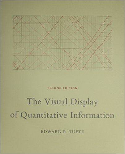
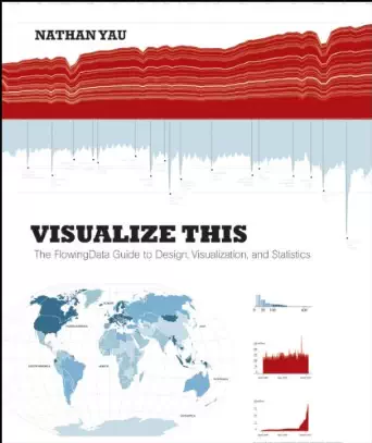
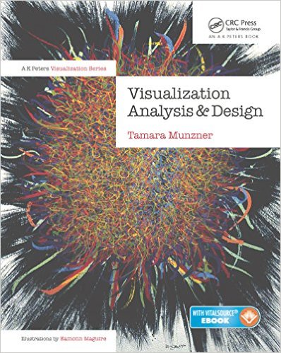
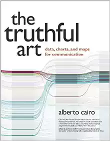
Books
.
Talks, Courses, and Articles
- Visualization Analysis and Design talks: Tamara Munzner’s slides on the theory and research of visualization analysis and design
- Interactive Data Visualization talks: Lynn Cherny’s slides on interactive data visualization, especially applied to journalism
- Interactive Visualization Course: Lynn Cherny’s course on interactive visualization design
- Data Stories: Fantastic podcast that interviews some of the best data visualizers from around the world
- OpenVis Conf Videos: Recorded talks from OpenVis Conf, Bocoup’s annual conference for data visualization practitioners
- Why Prezi makes you dizzy: How cinematography influences how slides and visualizations should be ordered
Resources
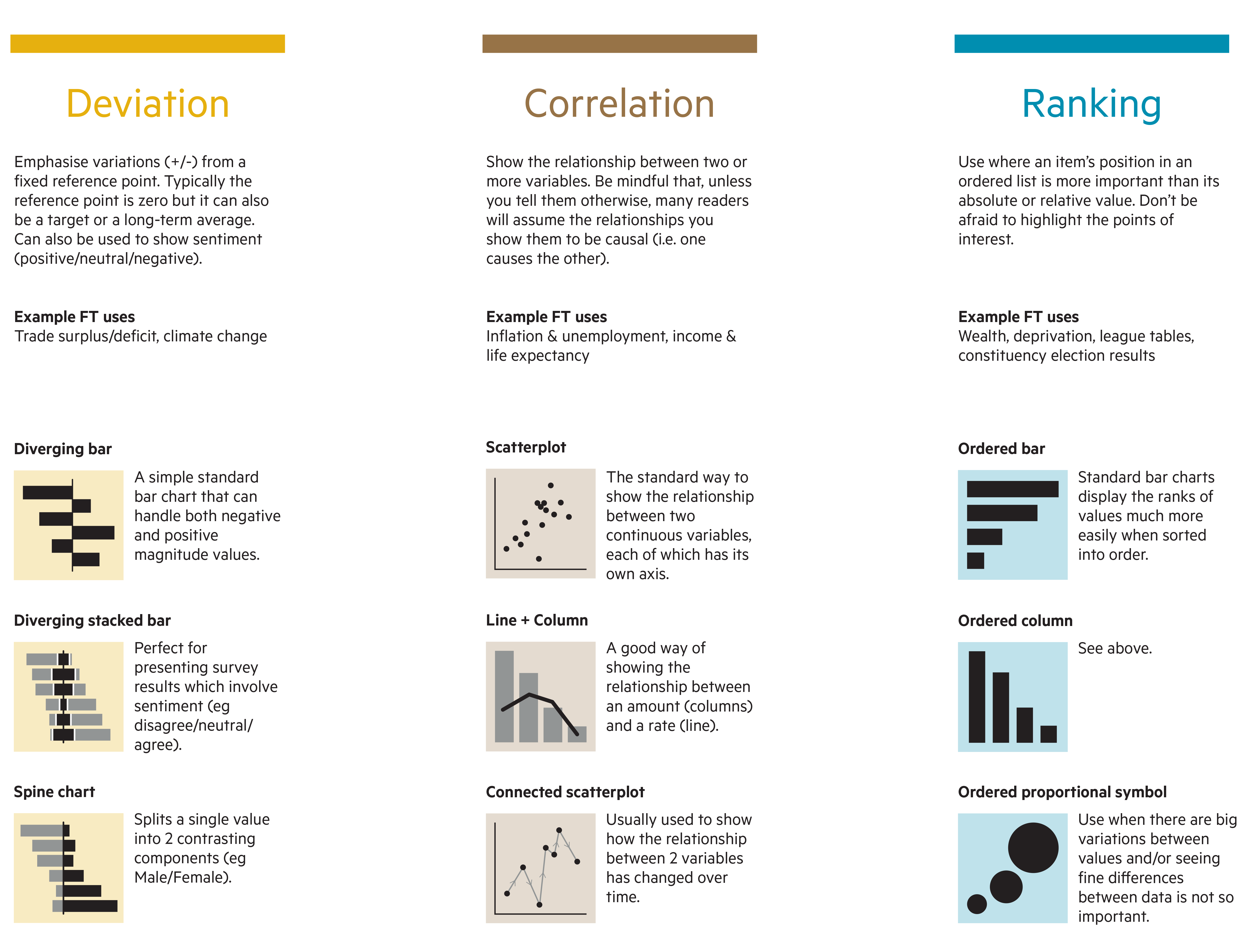
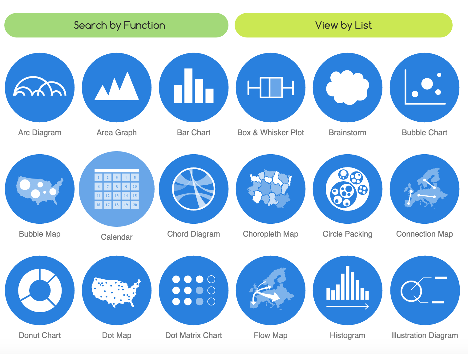
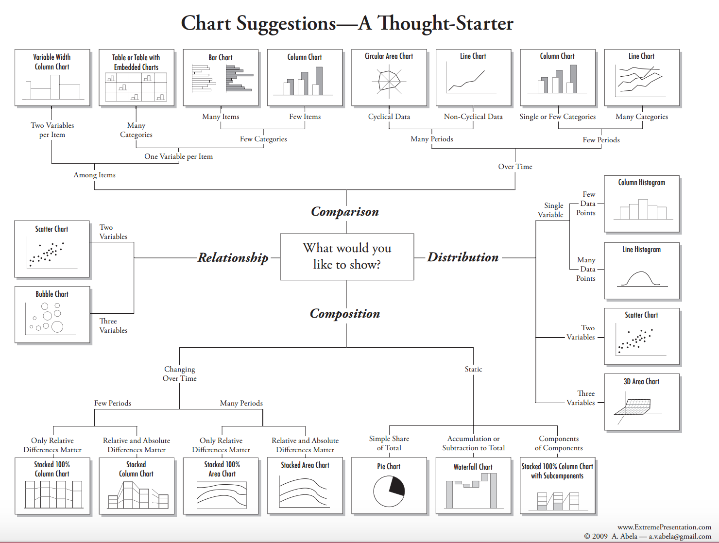
Chart types
Visualization in R
Color
- ColorBrewer: Cynthia Brewer’s color palettes for sequential, diverging, and qualitative data. When in doubt, use Color Brewer.
- Adobe Color: Adobe site for creating color palettes
- Color palette analyzer: Evaluate color palettes based on how easy they are to name
- Color palette examples
- Matplotlib color schemes: Explanation of how Matplotlib, Python’s visualization function, created color schemes
Fonts and icons
- Typography: explanation of key terms about fonts and general good practices
- Humanitarian icons: UN-OCHA free icons for humanitarian symbols
- Free vector graphics
Other Visualization Resource Sites
- Data Visualization Resource List: Matt Brehmer’s comprehensive list of useful visualization resources
- Visualization tools: gallery of software and tools to create visualizations
