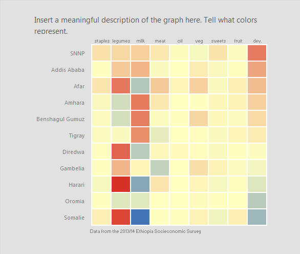
Heatmaps in Excel
Description
Heatmaps are an efficient way to represent large amounts of information structured in a table or matrix. Cell values are mapped to colors to create a visual representation of the underlying data.
Encoding
x: categorical
y: categorical
color (fill): numeric
How does the data need to be formatted?
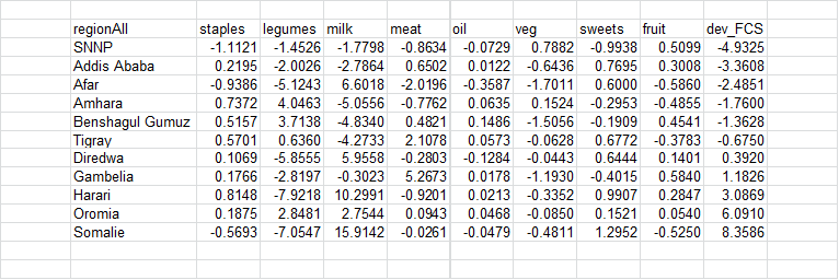
A table or matrix is necessary to create a heatmap. A format similar to the table below is ideal. Also, figure out a meaningful ordering for the data. For this example, we order the data from the most consumed food category to the least. We also sort from the most negative food consumption score deviation to the most positive.
Excel version
Excel 2010 for Windows
Instructions
-
Color data: Highlight the inner portion of the matrix or table you wish to visualize. From the
Hometab on the ribbon, click onConditional Formatting. From the drop down menu, selectColor Scalesand pic any of the diverging color scales.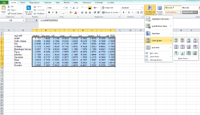
You now have a matrix that has been conditionally formatted. This is a good start, but we need to clean up the worksheet to get a clean looking heatmap. - Format color: Highlight the inner portion of the matrix and click on the
Conditional Formattingbutton again. From the rop down menu, move your mouse all the way to bottom and selectManage Rules.... This will launch the Conditional Formatting Rules Manager. When used properly, the manager can help you filter and format your data based on logical rules and conditions. At this point though, we are going to focus on changing the color of our heatmap.
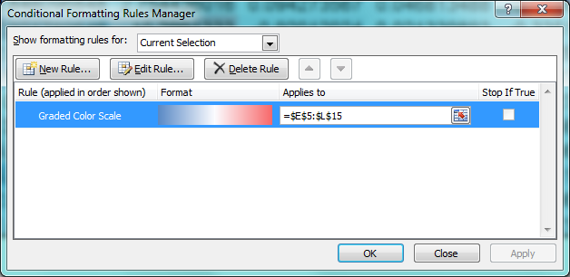 .
Double click on the color ramp next to the Graded Color Scale text. This will launch the Edit Formatting Rule Menu.
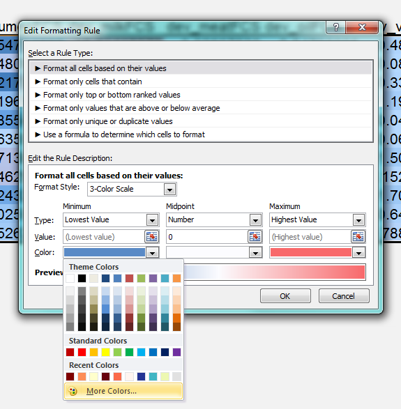
To change the colors of your heatmap, simply click on the color bar under each rule. We use a value = 0 for the midpoint because are data are centered around 0 and thus divergent. If you have continuous data, it may make more sense to use a sequential color ramp, with midpoint as the mean or median. To access the Red, Green, Blue (RGB) options, click on any of the color fields and select the More Colors… option. This will launch a new pop-up with two tabs, Standard and Custom. Click on the Custom tab to bring up the RGB editor.
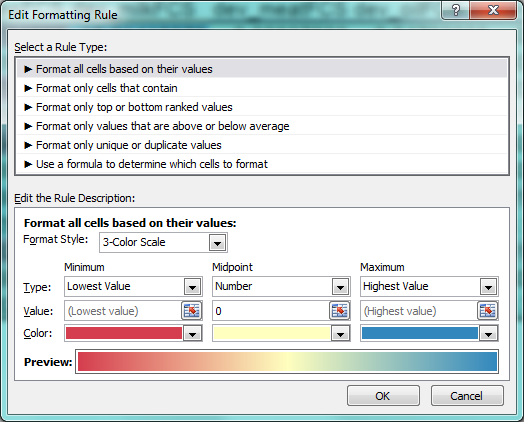
For our example, we use the following settings:- Minimum –> Lowest Value –> Red = 215, Green = 24, Blue = 43
- Midpoint –> Number –> Value = 0 –> Red = 255, Green = 255, Blue = 191
- Maximum –> Highest Value –> Red = 69, Green = 117, Blue = 180
-
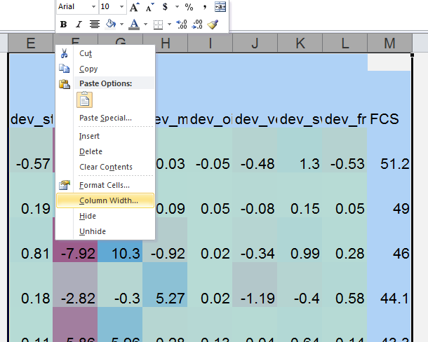
Resize cell width and height: With the standard Excel defaults, the columns tend to be much wider than the rows. To make our matirx a bit more visually appealing we resize the width and height of the cell values containing data. To do this, highlight the columns containing data (Columns C - K in this case). Once they are highlighted, right click anywhere in the shaded region. This will bring up a formatting menu. Select column width and set the value to 4. Repeat the same process for rows 2-13. Set the row height value to 38.
-
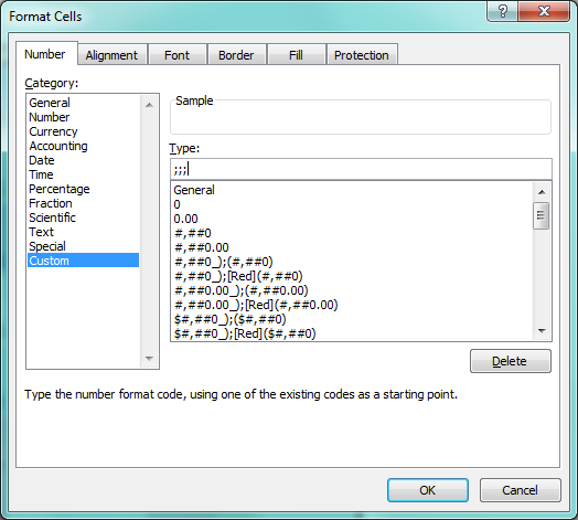
Format numbers: If the numbers in your data table are contain decimal values, you may have noticed that the formatting changes to “####” instead of a truncated number. If you wish to keep your numbers on the heatmap, highlight the colored cells, shrink the font, center the numbers vertically and horizontally, and change the number of decimal places using the Format Cells option that appears when right clicking. If you wish to hide the numbers, you can use a formatting trick. From the Format Cells menu, select Custom and enter
;;;into the box underneath “Type:”. Click ok. This will mask the values and you will be left with just a colored data table.
-
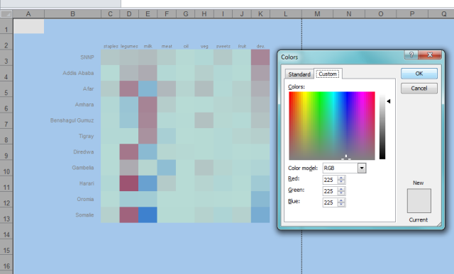
Change background colors: I like to fill the area surrounding the heatmap in a non-intrusive gray. To change the color of all the cells in the worksheet, click on the little triangle next to row 1 and column A. This will highlight all the cells. Navigate to the paint bucket icon on the ribbon and click on the down arrow just to the right of the bucket. This will launch the Colors pop-up. Click on the Custom tab and set the red, green and blue values to all be 225. This will fill the with a light shade of gray.
-
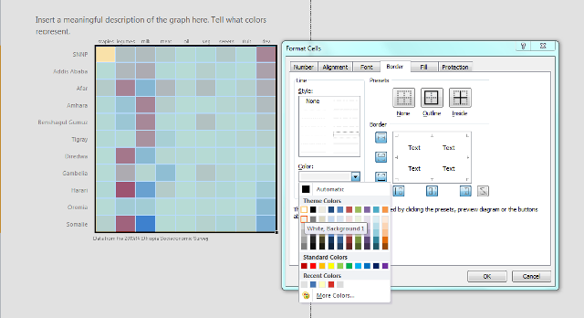
Make your heatmap pop: To add a frame and border to the heatmap, highlight the colored cells, right click, and select format cells. From the Format Cells pop-up click on the Border tab. Change the
Color:to be white, then click on the Presets for Outline and Inside. This will add interior and exterior white lines to the heatmap.
- Format text: As a finishing touch, change the font to a dark gray color, shrink the text size a bit, and center the column names. To do this, highlight the column names (columns C - K, row 2) and right click. Change the font to Segoe UI, set the font size to 7 or 8 and center the font. Repeat the process on the row names (the regions). Right align and vertically center the names using the options in the Alignment section of the ribbon. Finally, increase the indent to the right. Add in a meaningful title.
