Bar Graphs in Excel
Description
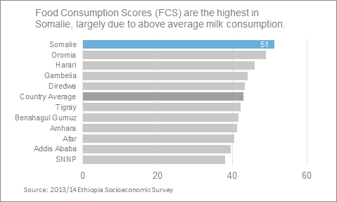
Bar Graphs are an effective visualization for comparing values across groups or categories. Bar graphs present grouped data as rectangular bars, where the length of each bar is proportional to the underlying data. In the tutorial below, we will demonstrate how to create a sorted bar graph.
Example
Encoding
x: categorical
y: numeric
color (fill): numeric or categorical
How does the data need to be formatted?
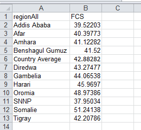
A simple data table is necessary for a bar graph. Data can be in a long or wide format.
Excel version
Excel 2010 for Windows
Instructions
-
Highlight the cell values that you wish to graph.
-
On the Excel ribbon, navigate to the
Inserttab, click on any of the graph types and select theAll charts Typesoption at the bottom of the pop-up. This will launch a new window with all of the graphing options. Select the bar graph option from the “Insert Chart” menu.After clicking OK, you will see a bar graph appear in your workbook.
-
Sort that data: Sorting your data not only makes your graphic look nice, it also encourages the reader to make comparisons. In this example, we will sort our data from the largest to smallest value using Excel’s sort option. To sort your data, navigate to the
Hometab on the ribbon and select the custom sort option from the drop down menu.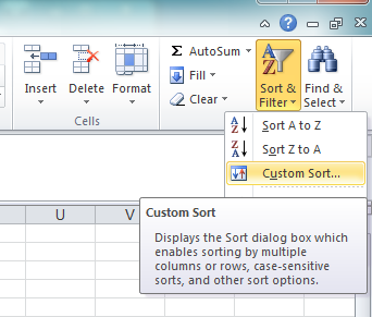
Select your desired columns over which you would like to sort your data. For the example, we sort the data from largest to smallest value. As you sort the data, your bar graph should change to reflect the sorting oder.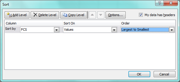
While the data are sorted, the largest value actually appears at the bottom of the graph. We will fix this in the next step (or you could resort your data from smallest to largest). -
Resort the axes, lose the y-axis tick marks: Navitage to
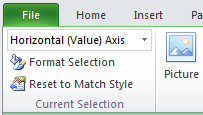
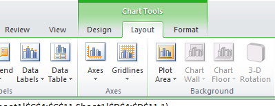
Chart Toolsand click on theLayouttab. Now, go to the top lefthand side of the page and select “Vertical (Category) Axis” from the drop down menu located directly underneath theFileoption at the top of the ribbon.
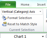
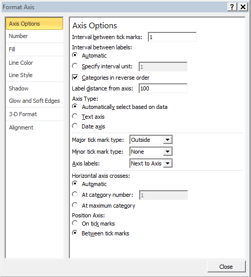
Click theFormat Selectionbutton. This will launch a new pop-up window. Click on “Axis Options”.
Check the box “Categories in reverse order”. This will move the largest value to the top of the graph. From the same menu, navigate to theLine Coloroption and check the “No line” radio button. This will remove the ticks on the y-axis. -
Move x-axis labels from top to bottom: While it’s nice to have a label on the x-axis, in this case it is a bit distracting (see chart junk). We are going to move the labels from the top to the bottom. At the top left of the screen, navigate the menu to “Horizontal (Value) Axis”. Click
Format Selection.
Under the “Axes Options” tab, find the box that reads “Axis labels: Next to Axis”. Click on the dropdown and select “High”. This will move the axis to the bottom. To remove the x-axis, click on the “Line Color” option. Check the radio button next to the “No Line” option. -
Increase the bar width: To increase the weight/width of the bars, click on
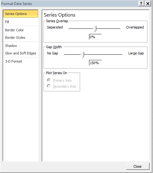
Chart Tools --> Layoutmenu. Select the “Series (name of variable)” option from the top left-hand side. Click on theFormat Selectionbutton.
The Format Data Series menu box will pop up. With the “Series Options” selected, move your cursor to the Gap Width slider. Move the slider to 25% or manually type the value in. This will decrease the gap width between the bars. -
Change the bar color: From the same menu, click on the “Fill” option on the left hand size. Select the “Solid Fill” radio button and click on the Color menu. Select more colors at the bottom of the menu. We will use the Red-Green-Blue values from ColorBrewer 2.0 to help us pick a gray. Change the Red, Green and Blue values all to be 200. Click ok. This will change all your bars to a medium shade of gray. If you would like to change the color of a single bar, click on any of the bars to select them all. Then, left-click on the bar you wish to modify. This will isolate the selection to a single bar. Repeat the above steps to add a meaningful splash of color.
-
Drop the legend: Legends are often distracting and can force the reader to work. Readers are lazy, make it easy on them by directly labeling and annotating your graphs. Click on the legend in the graph. Once it is highlighted, press the delete key.
-
Directly label and change number formatting: From the
Chart Tools --> Layout --> Data Labelsmenu, select the inside end option to add data labels.
Now, navigate back to the chart layers menu at the top left and click on the “Series (your variable) Data Labels” dropdown. ClickFormat Selection.
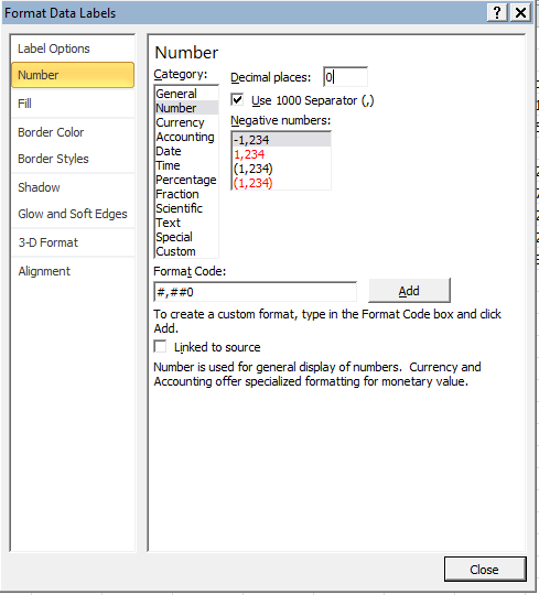
Navigate to the Number option and under “Category:” select Number. Set the decimal places to be 0. Hover over the data labels on your graph and left click to highlight them, then right click. From the formatting window change the font color to be white, or use the more color options to change the RGB values to 0, 0, 0. -
Formatting the Horizontal Axis Major Gridlines: Navigate to “Chart Tools” and click on the “Layout” tab. Go to the top-left hand side of the page and select “Horizontal (Value) Axis Major Gridlines” from the drop down menu. Click format selection. Click on the line color option. Change the line color to be the same as the bars. Next, click on line style. Change the dash type to the second option (round dot).
-
Change the font and color on the text: Select the y-axis values. Right click. Change the font color to a medium shade of gray (127, 127, 127). Repeat the same process with the chart title. Click and drag the chart title to the left hand side. Insert a meaningful title for your bar graph. Finally, click on the chart and change all the fonts to be Segoe UI.
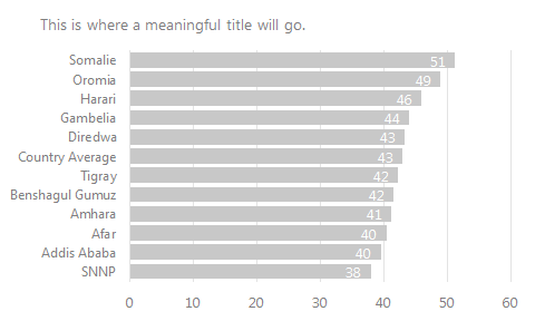
Congratulations, you have just made a nice looking bar graph. -
Save the chart as a template: If you would like to save the completed bar graph as a template, navigate to “Chart Tools –> Design” and locate the
Save As Templatebutton at the top left. Click on the button, give your template a name, and click OK.To apply your template, highlight the data you would like to graph. Click
Insertand select any chart type and select the “All Chart Types” option. Inside the window with all graphing options, click on the “Templates” folder at the top. This will contain the template you just saved. Apply it to your data.
