part 4
Data Visualization
Introduction
Now that we have data in a tidy format and have started to do some basic analysis, how can we make sense of all the information? Data visualization is a powerful way not only to communicate what you discover to other people, but also to explore and understand data yourself. We will introduce principles of data visualization common to any information design, whether it’s a hand-drawn sketch or an elaborate web-based interactive tool.
Part 4 Goals
- become a critical consumer of data visualizations
- understand best practices and principles to convey information graphically
- apply these practices and principles to implement a visualization of real data
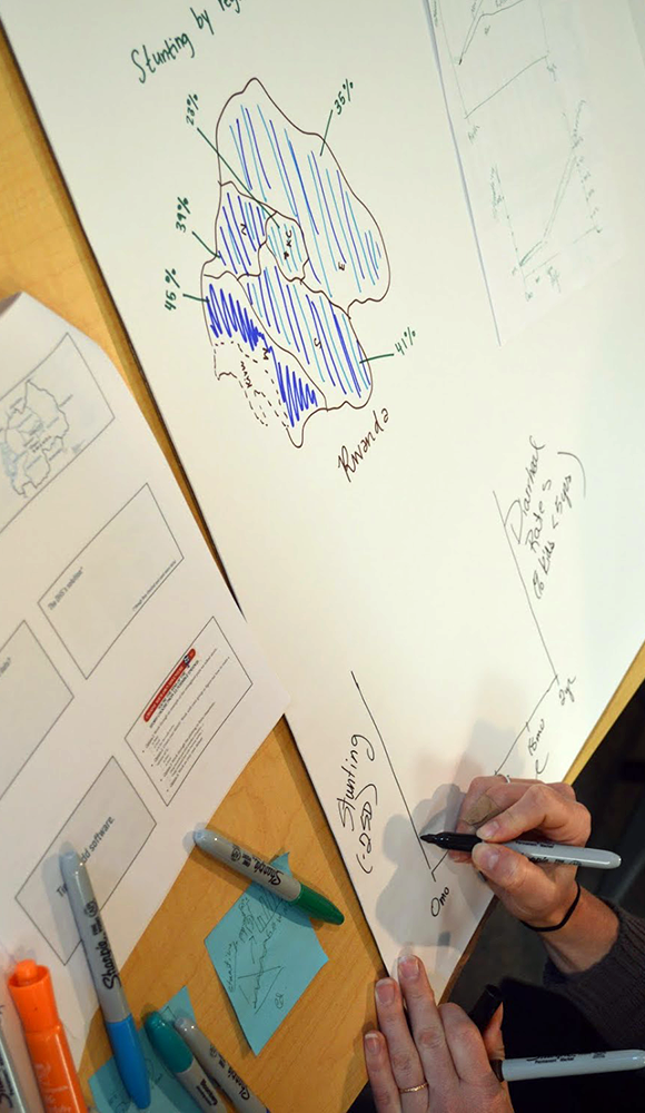
Warm-up exercise
Sketch as many ways as you can think of to represent two numbers: 75 & 37. Inspired by Santiago Ortiz
What to remember?
- Identify your audience
- Create comparisons within the data
- Simplify: Get it right in black and white
- Provide context – annotate
- Iterate, share, iterate, share…